Low-Carbon Digital Product Design with Michal Wisniowsky | Episode #79
Michal Wisniowsky explains lean UX research, visual climate storytelling, low-carbon interface choices, and why AI cannot replace user empathy.

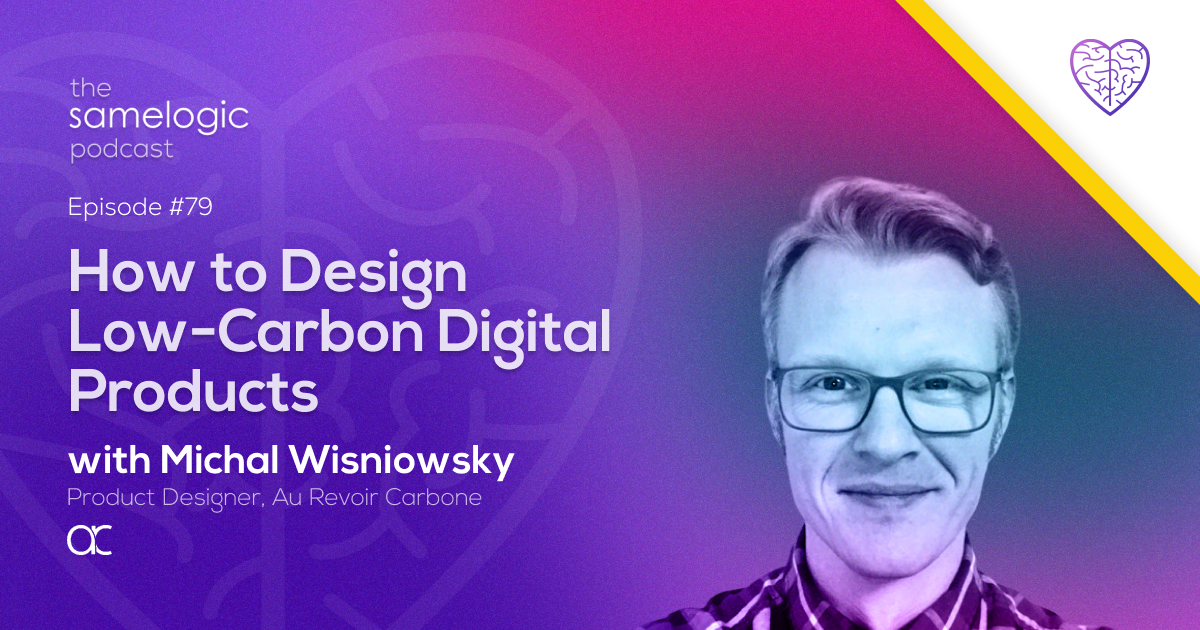
Michal Wisniowsky approaches product design through the habits he developed in the arts: iterative making, audience engagement, visual communication, and collaborative problem solving. His earlier work included museum exhibitions and a nonprofit arts organization, but he eventually wanted to apply those skills to problems with a broader impact. That interest led him toward user experience, product design, mission-driven companies, and climate work.
In this conversation with Dwayne Samuels, Michal examines a challenge that reaches beyond visual polish. Climate products often need to explain complex or invisible services without overwhelming people, while the digital experience itself also consumes resources. His response combines lean research, concise communication, concept mapping, and careful visual choices.
What you'll learn
How startup constraints shape a lean approach to user research and testing
Why low-carbon digital design requires attention to page and screen intensity
How concept maps can become illustrations or data visualizations
Why climate products must balance scientific detail with concise communication
Where AI can assist designers without replacing direct user empathy
Make climate concepts visible without overloading users
Michal describes carbon removal as a particularly difficult design space because the product or service a customer buys is not visible. The team is often selling an idea that must be explained before it can feel concrete. That creates a communication tradeoff: users need enough education to understand what they are getting, but a dense scientific explanation can make the experience harder to absorb.
His practical method starts with concept mapping. He maps the product, the business around it, and sometimes the wider industry to see the full system before deciding what the interface should show. The map can then become a visual representation, such as an illustration or data visualization, that explains a process in a quickly digestible form. For a climate product, that might help a user understand the service's lifecycle, where the user enters it, and how the parts connect.
The lesson for product teams is to treat visual communication as part of comprehension, not decoration. Start by identifying the minimum understanding a user needs to make progress. Map the underlying system, then choose the visual form that communicates it with less effort than a large block of technical copy. Scientific depth can remain available, but it should not be the only path into the product.
Research at the speed and scale of a startup
Michal's research experience has primarily been in startups, where limited bandwidth and resources can prevent a team from running every study it would prefer. He says that teams often move toward lean UX, intentionally or otherwise. In an early-stage company, testing may happen organically: designers gather available colleagues, test ideas on the fly, and learn while iterations are moving quickly.
That constraint does not remove the need to understand the problem. Michal especially enjoys the early phase of learning, ideation, and brainstorming. He brings stakeholders into that work because people outside design and research can contribute knowledge from their own roles. Collaborative exploration can surface angles and solutions that one designer would not have considered alone.
For teams with little research capacity, his account suggests a usable sequence. Clarify the stage of the product and the decision that needs evidence. Test the smallest useful representation with the people available. Bring domain experts and stakeholders into ideation without confusing their reactions for direct user evidence. Then deepen the research as the product, risk, and available resources grow. The goal is not to present an improvised test as comprehensive. It is to keep learning connected to each fast iteration.
Reduce the footprint while protecting the human connection
Michal is drawn to minimal and concise design, including strong typography and efficient use of elements. In climate work, that preference also has an environmental dimension. Every web page or app screen has a carbon footprint, and more intensive experiences can have a larger one. He uses online calculators to estimate the footprint of a page or screen and argues that sustainable UX should be considered when designing climate products.
This gives designers a concrete review question: does every visual and interactive element earn the resources it requires? Minimalism is not automatically usable, and the transcript does not offer a universal emissions formula. It does offer a practical habit: measure the digital experience, reduce unnecessary intensity, and make concise choices serve both understanding and sustainability.
Michal sees AI as useful for processing and digesting large amounts of information. He does not see it replacing the designer's direct connection with users or the ability to empathize with a person's circumstances and pain points. New tools may accelerate analysis, but they do not remove the need to speak with people. For teams building climate products, that distinction matters. Efficiency can support the work, while human understanding still determines whether the product explains the right problem in a form people can use.
Listen to Michal Wisniowsky discuss sustainable UX, climate communication, startup research, AI, and empathy in the full episode: Listen to Episode #79.
Continue with the workflow pages
Use the ideas from this episode inside the selector, Playwright, and bug-reproduction pages that connect content to product intent.
 Install the Chrome Extension