Case Study: Fake Door Concept Testing With Giftme Jamaica
How Giftme does rapid prioritization to validate and gather user feedback on a new feature idea in minutes, using no engineering effort.
Use case: Feature Prioritization, Feature Demand Testing
Website: https://shopgiftme.com/
Team size: 6
Company Stage: PMF > Fast-Growing MRR
Industry: E-commerce Platform
Technology Platform: PHP, Tailwind CSS, React
🤔 Problem
Giftme is a B2C digital giftcard platform. They received signals from their users that they wanted to upload a video with their digital gift card purchases.
The team wanted hard evidence of feature usage before investing engineering effort into building the feature.
📊 Metrics
We have two critical metrics for teams at this stage:
Time To Learn: The team needs to spend as little time as possible on validating features. Initially, this is done by hacking the minimum viable product (MVP), which can take weeks. This is when they learn if the feature is used or not.
Revenue & Usage: The teams want to know that what they're working on will be used and how it impacts revenue.
Morale: When teams have hard evidence that their work is in demand, they perform better. Especially lean teams that collected payments or signups before building.
🧙♀️ Personas
All of the personas involved in conducting this test.
Rushio Billings: CEO - fullstack engineer
Rojay Simpson: CPO - frontend engineer and designer
Rashidi Thomas: COO - marketing and sales.
🧪 Methods
Planning
Over dinner, the team discussed the product and business, including feedback from users they have been talking to in person.
Users have been telling them they want to record and upload a video to accompany their digital gift card purchase.
Other competing digital gift card platforms also have this feature.
The team estimated it would take a weekend to build and would like to test the demand before making it.
The team decided to use Samelogic to conduct the test. Samelogic allows you to inject some UI components into a website and measure how many people clicked and answered a survey.
Measuring
Our test will measure two things:
click-through rates (CTR), which is the percentage of users who clicked the feature of the users who saw it. The results here are subjective, and the team must decide what they call failure.
Survey responses, which contain questions we need to ask the user to learn something more about why they are clicking the feature. In this case, we want to know if users will pay extra to include a video.
A survey also solves the false-positive issue, which is why this method does not require a control group and statistical significance, which is found with the AB test. AB testing is not a viable method for validating features because of this.
Designing
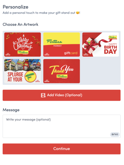
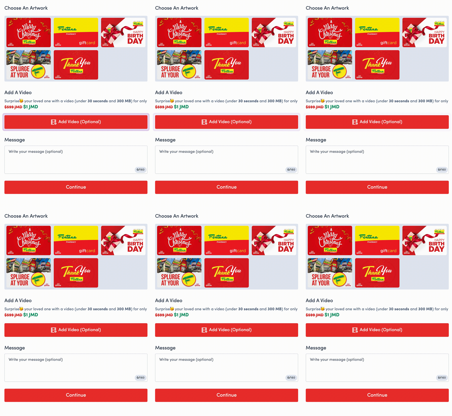
The goal: we want to inject a video upload button during the checkout flow.
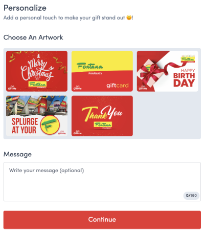
The checkout flow currently looks like this:
With the feature, the flow should look like this:
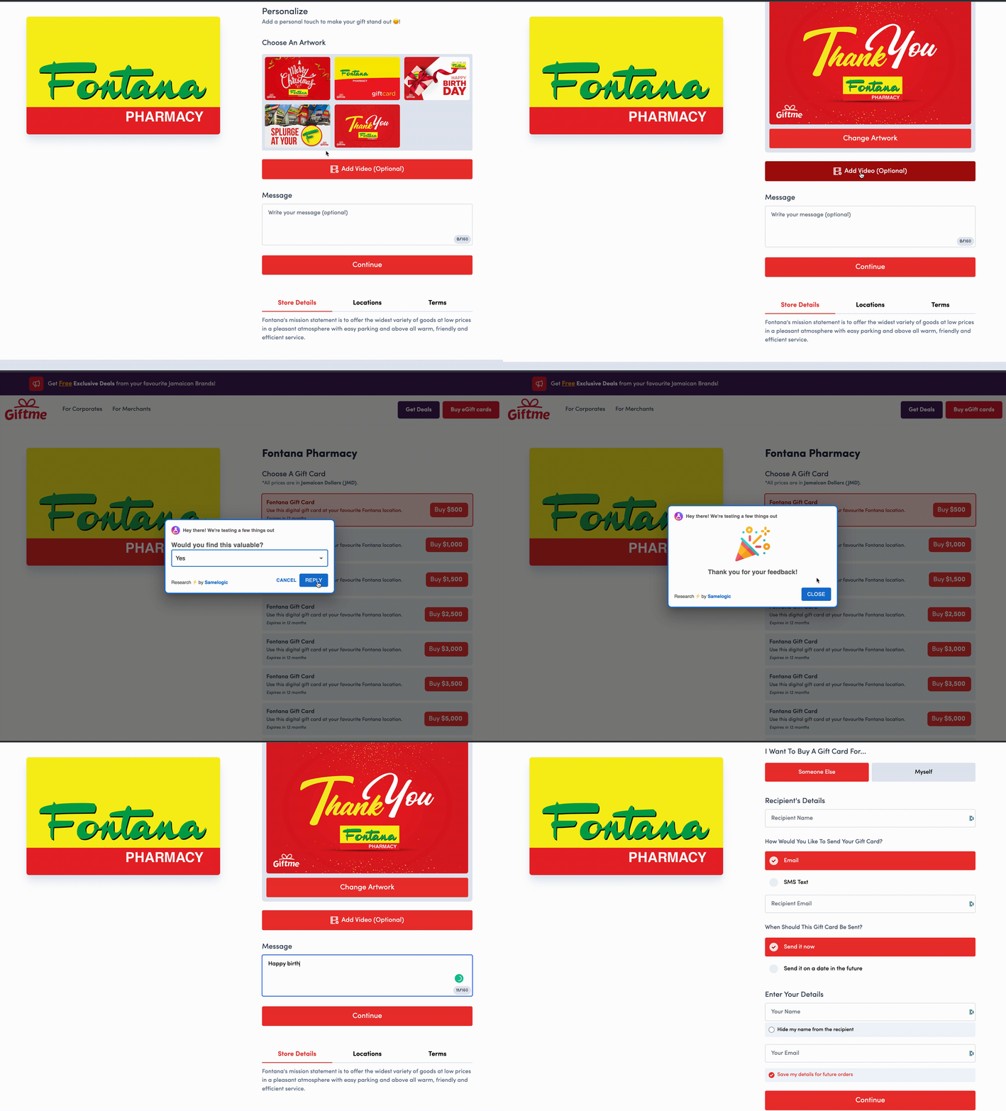
The test should function as in the animation below:
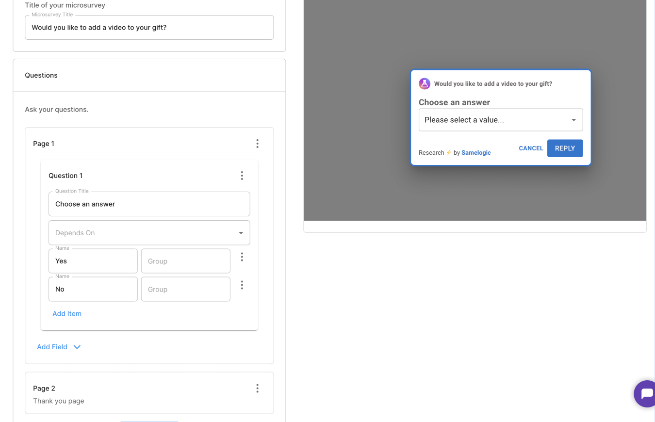
The "Add Video" button is a mock, no functionality behind it. When the user clicks the button, an in app survey is fired to collect some additional information such as how much would they pay.
Execution
All team members played a role in executing the test.
1. Rushio installed the Samelogic SDK into their `<head>` tag and tested it in their dev environment.
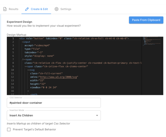
2. Rojay designed the CTA for the video upload feature, a simple button in their checkout flow. This was done in plain HTML, and its look and feel were tested locally. An empty container with a known HTML id was created and shipped to production.
3. In the Samelogic dashboard, a new test was created, and the HTML and container id was added.
4. Rashidi and Rojay brainstormed the survey questions to determine how to collect pricing data. This was set up in the Samelogic dashboard.
5. The test was launched to all users immediately and monitored by the Samelogic team.
Watch the setup process here (< 1 min).
✅ Setup Time: 1-2 hours
📈 Test Results
This test will measure the conversion rate and survey response rates. You can see what the users are also saying.
In Giftme's case, they were lucky to start seeing good results on the first day of launch. It has become like a game and celebration 🎉. The team was always calling our engineer Nicolas for updates.
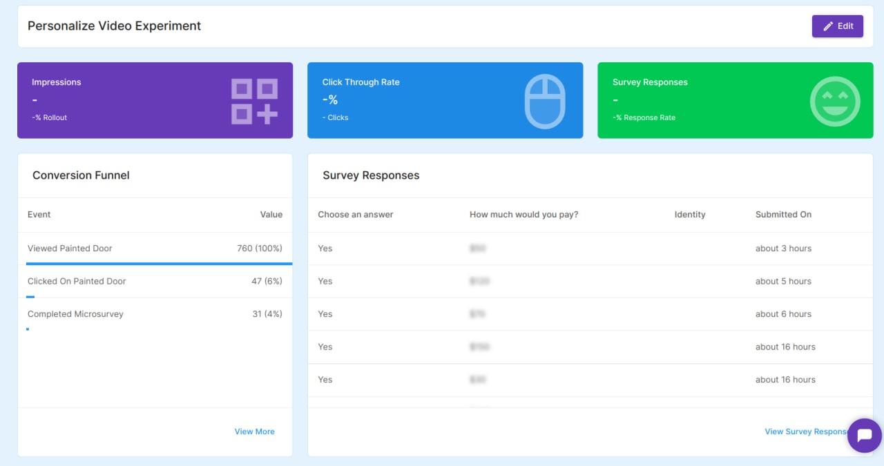
This is what their dashboard looked like.
They paid us $5 to see the pricing data. 🤑
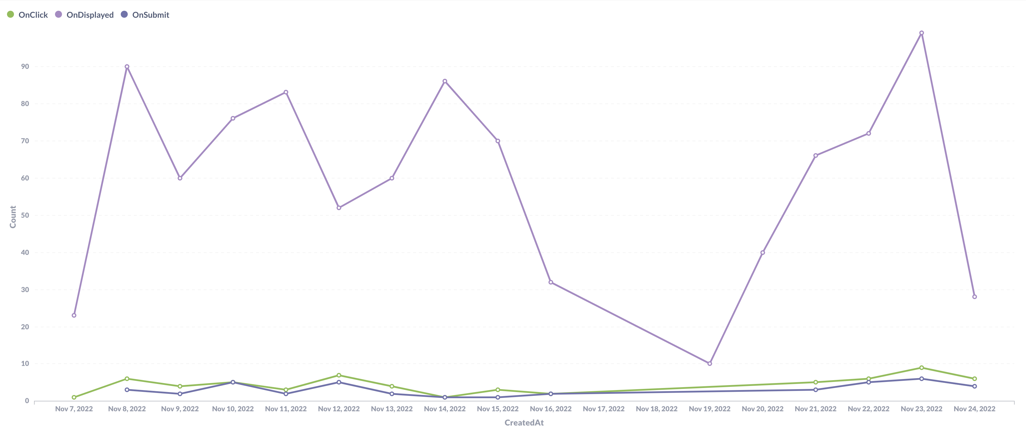
The time series data could be queried with a tool like Metabase until we build this into the product.
This chart shows that the feature usage remains consistent up to Nov 16, where we turned it off for a while.
In this case, with a 7% CTR and 3% response rate on the second day, the team decided to move the feature into development. This will be subjective based on your product and users.
✅ Time To Learn: 2 Days
🏁 Let the development begin
We followed Giftme throughout their development process to correlate if the feature would do as well as the real thing.
Software development estimation is never on point. They encountered many unforeseen issues, such as file size upload limits when users tried to record in 4K.
The feature went live two weeks later rather than the estimated two days.
Giftme had left the test running until they shipped the feature. This meant that we had to let now the users know this was the real feature and not the Fake Door.
❗️Important: They designed the button to pulsate to attract new and old users who fell into the experiment.
❤️ Product Results
No feature takes off the first time. They had to play around with messaging about pricing until they ran out of capacity on this feature, but it was now generating some revenue.
Not as much as was predicted in the test because not all users follow through with the checkout.
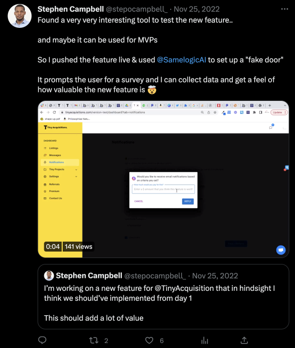
Rojay was so happy with the test results that he told Stephen Campbell, CEO of TinyAcqusitions. Stephen implemented our test on a feature he was working on; we have that case study here.
⚡️Conclusion
The concept test correlates with the usage of the actual feature, but now they have a downstream conversion rate optimization problem.
The method works, but there are nuances, as with every feature and product. The core principle is to ship as early as possible.
The ethics of the method is subject to scrutiny due to poor user experience, but it is a trade-off the team was willing to take to ensure that what they're about to build will be used. If the idea is terrible, most users won't click it anyways.
If the concept test had failed, they would have lost two weeks of work, more than 5x of the estimated time. This is a good trade-off for investing less than one hour in running these tests.
PS. keep an eye out on this page, we will be publishing Giftme's test configs there. It is meant to serve as a review, test and run page.
Related workflows
Move from editorial context into the selector, Playwright, and bug-reproduction pages that turn exact UI evidence into action.


